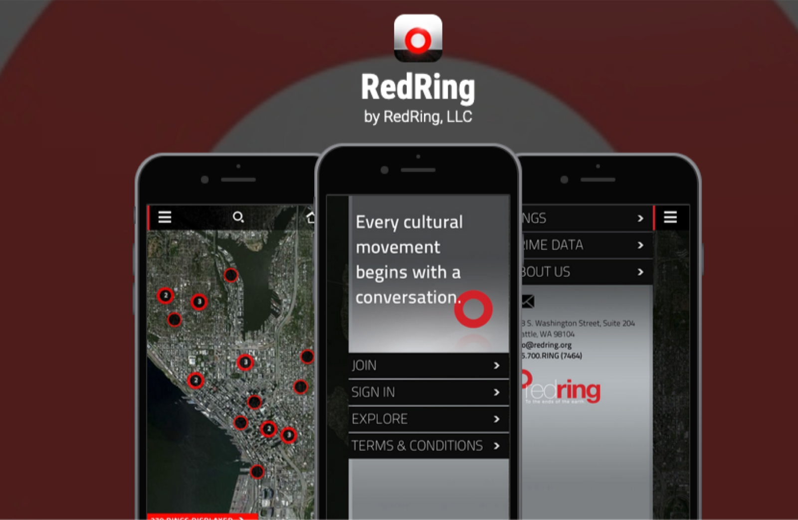
Community Platform · RedRing
RedRing
01
How it started
I didn't know what UX design was when I took this job.
RedRing was a startup founded by the president of a homeless shelter and a Seattle marketing agency. The idea: a location-based app to help everyday people connect with resources and organizations supporting the unhoused in greater Seattle. I was working as a graphic designer and communications manager when the founder saw me speak publicly — liked what he saw, and asked me to join.
My job was to get the app into the world — demo it, populate the map, build relationships, and find out if anyone would actually use it. I wasn't the designer. I just went out and tried to make it work.
02
Two years in the field
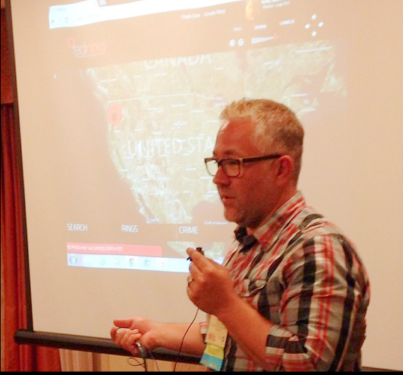
For two years I traveled across the Pacific Northwest — shelter workers, neighborhood watch groups, city councils, pastors, tech companies — pitching the app, entering backend data by hand, and watching what happened when real people tried to use it. I flew to St. Louis to pitch homeless shelter organizations. I went to every conference I could find.
The presentations always went well. People nodded, said it was exciting, asked great questions. Then nobody used it. That became the pattern — and I spent two years trying to understand why.
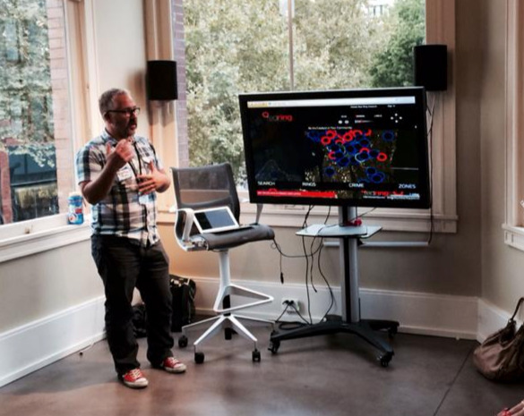
Presenting at a Seattle tech conference
Downtown Seattle
03
1st Avenue
One afternoon I was walking down 1st Avenue in downtown Seattle with the app's developer. We came across two people experiencing homelessness. He opened the app and offered to help find nearby resources.
"Yeah, we know all those places."
We stood there for twenty minutes. They didn't need a map. They needed someone to stop and see them. The app was solving the wrong problem — and I'd been watching it fail in slow motion for months without having the words for it. Now I did.
04
What I found
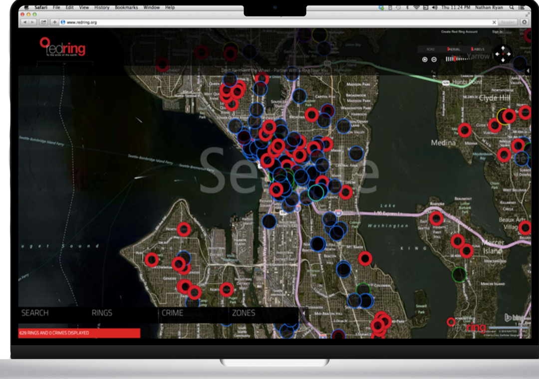
Over the following year, I immersed myself in researching and testing the app alongside its intended users — homeless shelter workers, neighborhood watch groups, city councils, pastors, and tech companies in downtown Seattle.
The presentations always received a strong response. People were excited to see potential solutions mapped visually — imagination was sparked. But despite the enthusiasm, few people actually used the app. This became the theme over two years: I would present to interested parties, who would nod in affirmation — but nobody implemented or sustained its use.
I discovered two core barriers. On the technical side, our team was manually entering data for every organization, church, and non-profit — labor-intensive and nearly impossible to keep current. On the user side, even those passionate about helping were unsure how to engage directly. The app didn't solve the underlying problem: how to foster a human connection or enable real action.
05
The close
After two years I gave the stakeholders my honest read: the app wasn't sustainable and it wasn't solving the right problem. The organization wound down shortly after.
When it was over, a UX designer from Lexus came around — he wanted to acquire it and build something new. He asked who the designer was. I told him I wasn't sure I was one. I walked him through what I'd actually done: the field work, the research, the two years of watching and listening and trying to figure out what was missing.
He said: that's the designer. He offered to bring me on and start something together. I turned it down — but I never forgot what he saw.
Start with a problem. Not a solution.
Next project