Wearable Technology · Meta Reality Labs
Meta Wearables
Context
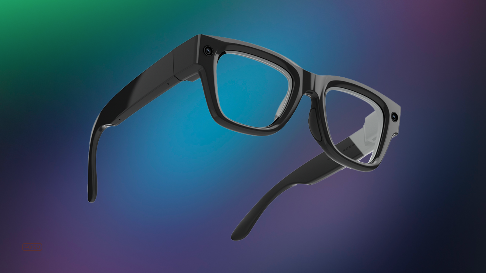
Meta Ray-Ban Display. Meta's first display glasses — a 600×600px see-through monocular display, EMG band input, and a portable charging case. New product category, new problems.
Early on, more than 20% of users couldn't explain why they'd use the display over their phone or regular Ray-Ban glasses. The hardware was there. The value wasn't.
"I'm not sure what value it's going to bring me yet — I understand the functionality, but am not sure when I'd choose it over my phone." Internal tester
I joined a small, nimble team tasked with building core experiences that would give the display a reason to exist. Over two years and 40+ projects, I led or contributed to the home experience, timer, status bar, live activities, audio ducking, gesture input, notifications, and accessibility — many of which shipped.
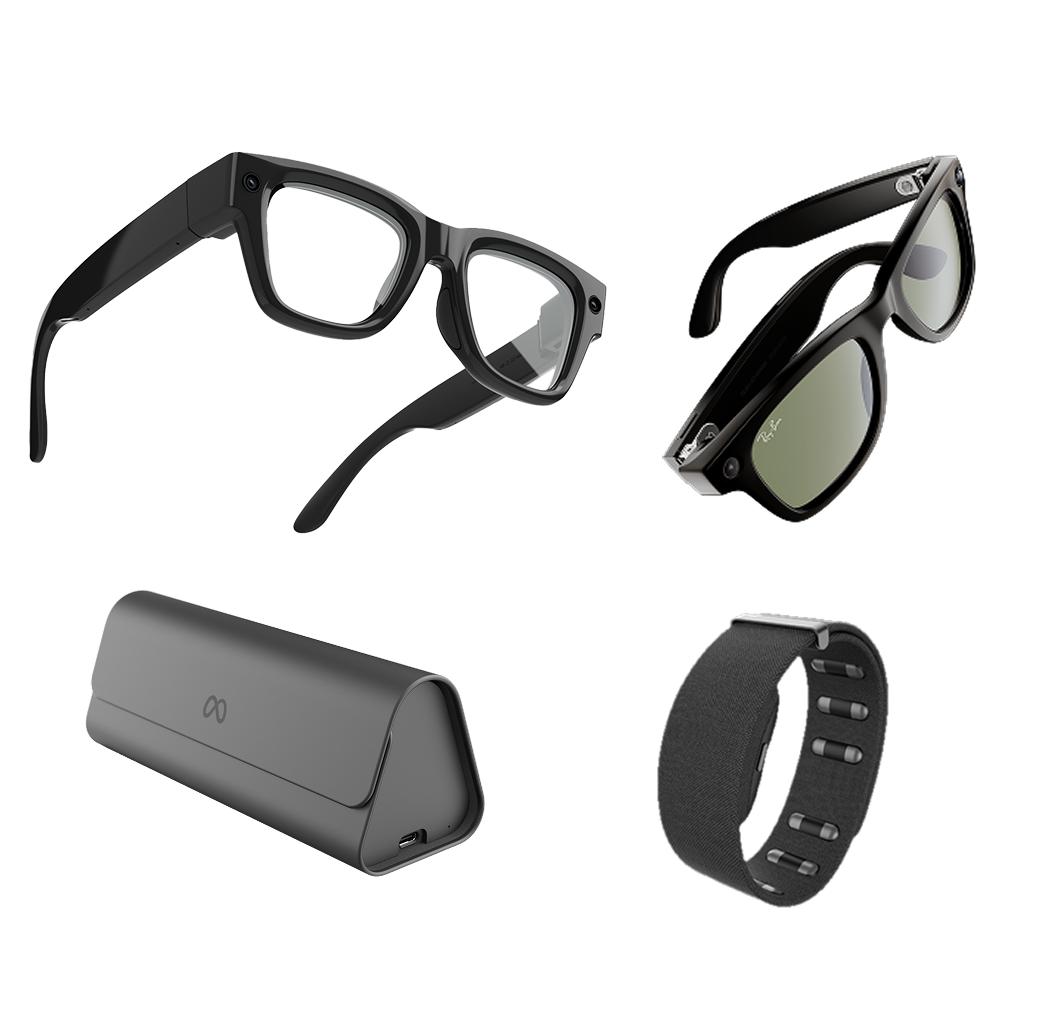
Meta's wearable ecosystem: Ray-Ban Display with neural band and custom charger
01
Glanceables
Users were relying on voice commands just to check basic info — weather, calendar, what's next. There was no way to look at the display and just know. We needed to build that surface.
"Your daily highlights, at a glance, and literally at your fingertips in seconds."
We started with research. A survey of internal users confirmed the top expected use cases — these became the five shipped glanceables.
88%
Calendar
77%
Weather
77%
Reminders
29%
Stocks
24%
News
I synthesized the research into three design principles that shaped every decision:
Quickly Access
Simple, familiar, intuitive
Quickly View
Easy to navigate and glanceable
Quickly Leave
Keeps the user in the moment
The work
The anchor point. First problem: how do users even get here? I designed a persistent anchor pill on the home rail — one tap, always there. The label shifted based on time and context, so the entry point itself was already useful.


Layout. I explored three approaches for the surface itself: expanding cards, horizontal scroll, and vertical scroll. Horizontal felt intuitive — but surprised me in testing. Users couldn't glance at adjacent cards without actively scrolling, which defeated the purpose. Vertical scroll won.
AI as widget. The widgets looked static but weren't — weather, calendar, and headlines were all AI-generated, not cached locally. The companion app passed your location to Meta AI, which pulled live data and rendered it on the display. Every card had to account for latency, failures, and variable model output. The goal was something that felt instant and native.
Glanceables shipped with the display glasses on Day 90 after launch.
Glanceables prototype — early iteration before handoff
02
Audio UX
Meta AI glasses have multiple competing audio streams: music, phone calls, Meta AI responses, and system earcons. A persistent positive volume offset kept AI and earcons two steps louder than music — always. The result was jarring, and users noticed.
"I had the lowest setting for the assistant volume, but now my coworkers can hear my assistant reading DMs — even when I'm listening to music on low." Reddit user
The problem wasn't just volume — it was the relationship between audio groups across both displayless and display glasses. I researched how competitors (iPhone, CarPlay, Tesla) handled multi-stream audio, ran studies with UXR, and designed two options.
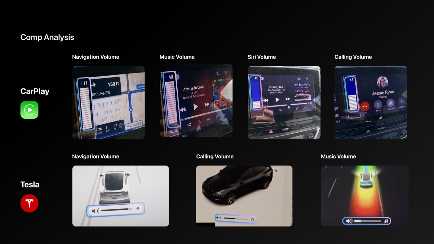
Comp analysis — CarPlay and Tesla volume UI across audio contexts
Option 1 removed the positive offset and introduced a minimum bound — low cost, low risk. Internal testing showed strong preference over the existing UX. This shipped in early 2025.
Option 2 introduced smart contextual volume controls with visual UI indicators on the display — more adaptive, and specifically designed for glasses with a screen. This is positioned for future iterations.
"I would prefer to miss a notification than to have it jar me in the moment." UXR participant
Making it visible. Audio problems are hard to communicate — you can't screenshot a volume relationship. Getting stakeholder alignment meant making the invisible tangible. I built a series of visual storyboards showing exactly how the competing audio streams were colliding, and where each option resolved the conflict.
I also worked with a prototyper to build an actual representation of the volume channels — a working model that let stakeholders see and feel how the streams yielded to each other in real time. That prototype closed the conversation.
Volume channel prototype — video only. Original included audio.
Also
2+ years on the team
2+ years, 40+ projects. I can't show everything in detail — but here's the scope of what I worked on.
Shipped experiences
- Timer — lead designer; two-week ship deadline with significant hardware constraints
- Status Bar & Indicators — persistent system UI layer
- Live Activities — dynamic, real-time display content
- Audio Ducking — how audio streams yield to each other
- Control Panel
- Photo Gallery Grid
- Search & Dictation — lead designer
- Running Activities — lead designer
Systems & frameworks
- Power-saving concept for AR smart glasses — collaborated with hardware and design partners on an early-stage exploration; UI explorations helped prove the approach could extend battery life by up to ~29% or boost display brightness by ~40%
- AI Attention Management Framework — designed the framework for handling competing AI and system interruptions on next-generation display glasses; establishing when, how, and whether the glasses surface information to the user
- Wearables documentation suite — a Hardware UX Human Interface Guideline covering software, hardware, and design specs (adopted as a template by other teams); "A Compass for Designing Gesture Interactions" for wrist and constellation input; and a Canonical Experience Model as the cross-product source of truth
- Wearables Interaction Logging Schema — telemetry design for input interactions
- Wrist Turn Gesture Support — specs & release
Process
- Accessibility Design Jam on Meta Ray-Ban glasses — led with Accessibility Design team
- Real-world internal testing and research — device testing in everyday contexts, including band rehearsal
Next project